
WCAG Contrast Checker
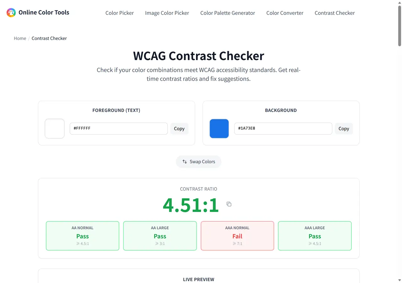
Check if your color combinations meet WCAG accessibility standards. Get real-time contrast ratios and fix suggestions.
Foreground (Text)
Background
Contrast Ratio
Live Preview
The quick brown fox jumps over the lazy dog
Normal Text (16px)
The quick brown fox jumps over the lazy dog
Large Text (24px Bold)
The quick brown fox jumps over the lazy dog
Small Text (14px)
Preset Color Pairs
How to check color contrast?
- 1Choose the foreground color — Select the text color using the color picker or type a HEX/RGB value.
- 2Choose the background color — Select the background color that the text will appear on.
- 3Check the results — See the contrast ratio and whether it passes WCAG AA/AAA for normal and large text.
- 4Apply suggestions — If the contrast fails, use the fix suggestions to find accessible alternatives.
Why use our WCAG Contrast Checker?
Our free online contrast checker helps designers and developers ensure their color combinations meet WCAG 2.1 accessibility standards. Good color contrast is essential for users with visual impairments, color blindness, and age-related vision changes. This tool provides real-time contrast ratio calculation, shows WCAG AA and AAA compliance levels for both normal and large text, and offers actionable fix suggestions when your colors don't pass. Use it to verify buttons, text overlays, form labels, and any foreground/background combination before shipping your design. The ratios applied above are the ones W3C defines in its Contrast (Minimum) success criterion, so a pass here means the same thing as a pass in a formal audit.
The four thresholds this page checks
Every card you see below the ratio comes from comparing one number against these four bars. Nothing here is this site's opinion: it is the WCAG 2 text contrast criteria, unchanged.
| Check | Minimum | Applies to | On this page |
|---|---|---|---|
| AA normal text | 4.5:1 | Body copy below 24px regular or below about 18.66px bold | The headline verdict |
| AA large text | 3:1 | 24px regular, or 18.66px and above in bold | Second card |
| AAA normal text | 7:1 | The enhanced level, body copy | Third card |
| AAA large text | 4.5:1 | The enhanced level, large type | Fourth card |
Two things this pair test does not cover: WCAG 1.4.11 asks for 3:1 between UI parts such as input borders, icons and focus rings rather than text, and 1.4.4 concerns resizing text rather than color. Both need their own check.
How the number is produced
Contrast is not the difference between two colors' brightness as an image editor shows it. It is the difference in relative luminance, computed after the sRGB transfer curve is removed from each channel. Two swatches that look equally bright to you can sit far apart on this scale, and a small edit to a blue can move the ratio more than a large edit to a yellow, because green carries the heaviest weight.
The calculation, exactly as this page runs it
// 1. undo the sRGB transfer curve on every channel
c = channel / 255
c = c <= 0.04045 ? c / 12.92 : ((c + 0.055) / 1.055) ^ 2.4

// 2. relative luminance, weighted for how the eye responds
L = 0.2126 * R + 0.7152 * G + 0.0722 * B

// 3. ratio, lighter color on top
(L1 + 0.05) / (L2 + 0.05)The added 0.05 stands for light reflecting off the screen. It is what keeps the scale between 1:1 and 21:1 instead of running to infinity when the darker side is pure black.
The result is rounded to two decimals for display, so a pair sitting on a threshold can look like it moved when it did not: white on #1a73e8 measures 4.505 and prints as 4.51, which passes AA by a margin thinner than the rounding.
Three pairs worth memorising
All measured with the formula above, in this page's own code.
| Foreground | Background | Ratio | Verdict | What it teaches |
|---|---|---|---|---|
| #FFFFFF | #1a73e8 | 4.51 | AA pass | A brand blue at full strength is barely legal for body text |
| #1a73e8 | #edf2f7 | 4.00 | AA fail | The same blue on a tinted panel drops below the bar |
| #FF5733 | #FFFFFF | 3.15 | large only | Fine at 24px, not fine at 16px |
| #767676 | #FFFFFF | 4.54 | AA pass | The lightest gray that clears normal text |
| #94a3b8 | #FFFFFF | 2.56 | fail | A slate that passes nothing, common in placeholder copy |
Reading the suggestions this page gives you
When AA for normal text fails, the amber panel proposes alternatives. Knowing how it builds them makes them easier to use rather than obey.
- They move lightness only, so the hue and saturation you are attached to survive the change.
- They pick a direction from the two colors' luminance: if the text is already the lighter side, you get a darker text suggestion, otherwise a lighter one.
- They are fixed-strength nudges rather than a solved answer, so the first suggestion can still fail. Paste the suggested value back into the field and let the page re-measure it.
- Nothing appears when AA already passes, which is a design decision rather than a bug - passing pairs do not need to be pushed further unless you are aiming at AAA.
What a passing ratio does not guarantee
4.5:1 is a floor with conditions attached, not a certificate.
- It is per pair. A page with an image behind the text has to hold up against the busiest part of that image, not the average.
- Opacity and shadows change it. Text at 80% opacity or with a translucent overlay is measured using the color the reader ends up seeing; use the picker on the rendered page to get that value.
- Size is not only font-size. The large-text bar depends on the rendered pixel size and weight, so a 16px heading is not large text at any weight.
- Dark mode is a separate audit. Inverted pairs are not equivalent, because luminance weights do not flip symmetrically.
To get the values you are testing, use the screen Color Picker on your own rendered page, or the Image Color Picker on a screenshot. If the pair came from a generated set, the guide to website palettes covers which role each color should take.
Recording the decision next to the tokens
:root {
  /* the pair that shipped */
  --link: #1a73e8;
  --surface: #ffffff;

  /* the same link on a tinted panel measures 4.00:1 -
     under AA for body text, so the panel needs a new value */
  --surface-tint: #edf2f7;
  --link-on-tint: #155bb5;
}A comment that names the measured ratio is the cheapest possible accessibility documentation, and it stops the next person from 'tidying' the color back to the failing one.